La Chapelle
The Challenge
Post-pandemic transformation
Changes in consumption patterns after the epidemic and inflation have led to 50% of consumers being inclined and willing to use mobile apps with services such as pastry shops and bakeries. As orders grew, French pastry shop La Chapelle needed to design an app to help them manage orders and help consumers complete online shopping easily and hassle-free.
Key Insights
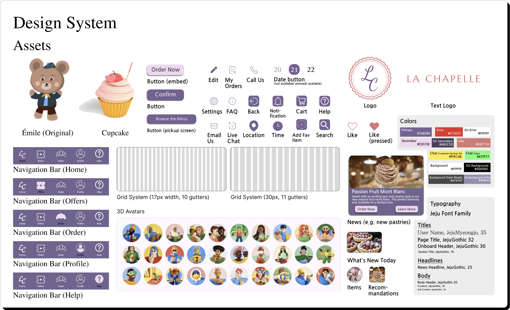
Design System
Client
Google UX Design Course
Year
2024
Duration
2 Months
Platform
Native Mobile Application
Tools
Figma, Clip Studio Paint
Executive Summary
Goal
Create a digital solution to reframe the way of consumption and experience in French pastry shops through user research, such as polling, allowing La Chapelle to maintain stable operations in the post-pandemic era.
Solutions
Research
Online surveys
Research Insights
My Role(s)
Accessibility UX Designer
As the Lead Accessibility UX Designer for La Chapelle App’s design system, I standardize and improve the accessibility of the app's components and patterns by developing strategies and specifications. In addition to incorporating the needs of people with disabilities into the design framework, I created new components, specs, features, and tools for the new design system to adhere to WCAG compliance and make it easier for users to enjoy the accessibility design of the app.
UX Writer
I created and tested written content for the mobile app La Chapelle. I finalized the language, voice, and tone of the app to ensure cohesion and effective and clear communication of the purpose and value of our product to users.
I conducted 4 online surveys to understand how often consumers buy French pastries, how long they can wait in the pastry shop, their opinions on the launch of La Chapelle’s app, and what features they expect to see on the La Chapelle App. My target audience ranges in age from 21 to 65 years old and has different living situations (i.e. living alone, with parents, roommates, college students, etc.). My questions prompted participants to talk about their experiences, specifically their pain points and their experiences shopping at patisseries in the post-pandemic era.
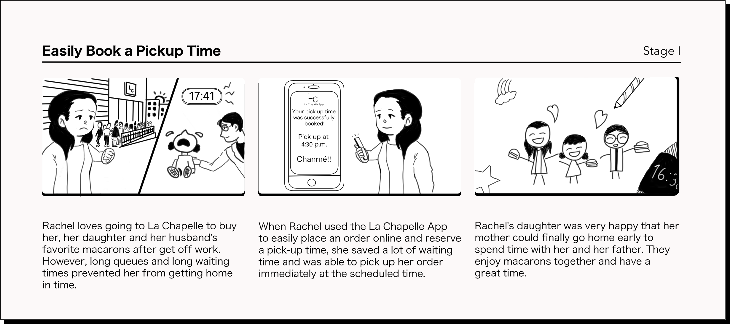
Before storyboarding, I tried to role-play three users and empathize with their frustrations and needs.
Prototyping & Iterations
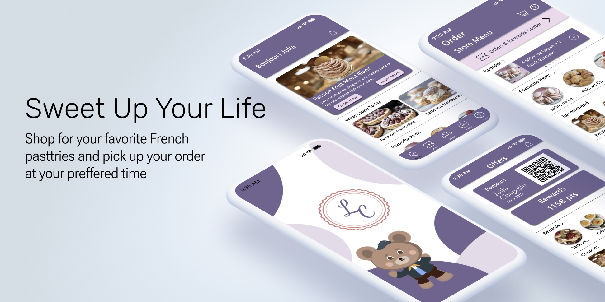
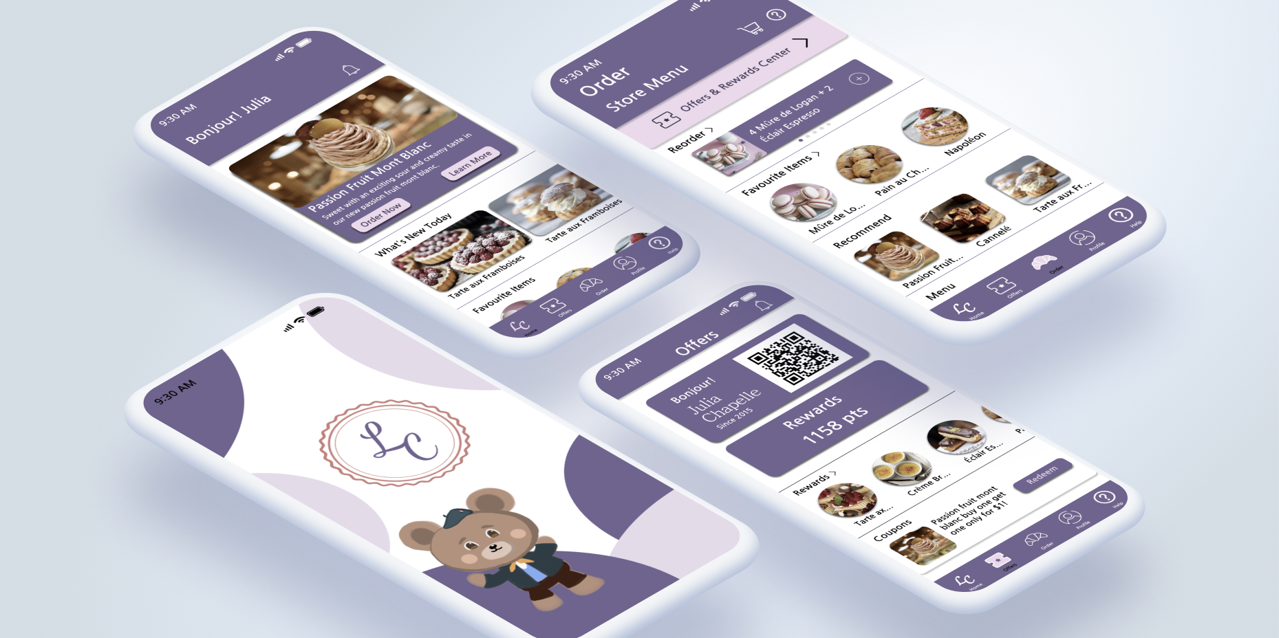
La Chapelle is an app that allows consumers to not only easily order their favorite French pastries online using digital coupons, but also contact customer service for support and browse the app in a barrier-free environment.
Most consumers shop at a patisserie at least once a week.
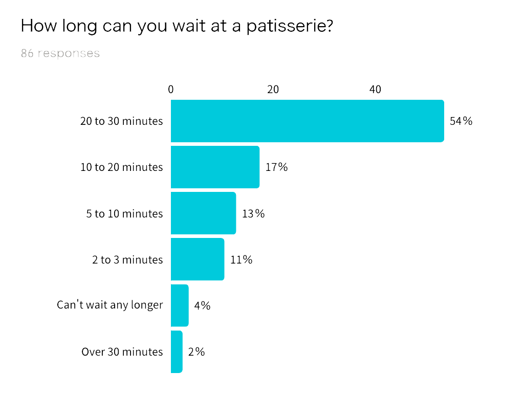
90% of consumers aged 21 to 30 are willing to wait 20 to 30 minutes. However, consumers aged 50 to 65 cannot wait that long and have to abandon their shopping process.
Among pastry consumers, 50% are willing to try La Chapelle’s mobile app.
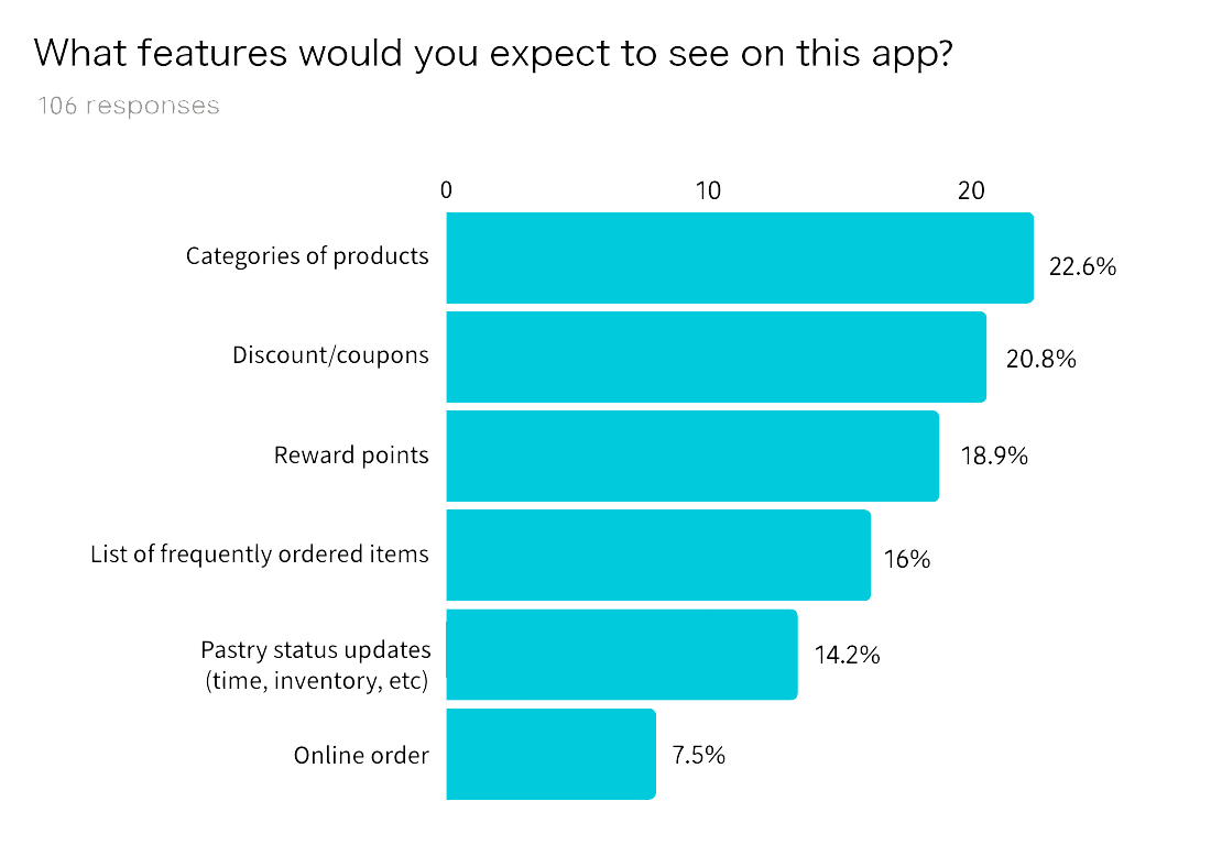
What consumers most wanted was for the mobile app to have clear item categories that would allow them to browse pastry shop items and shop easily.
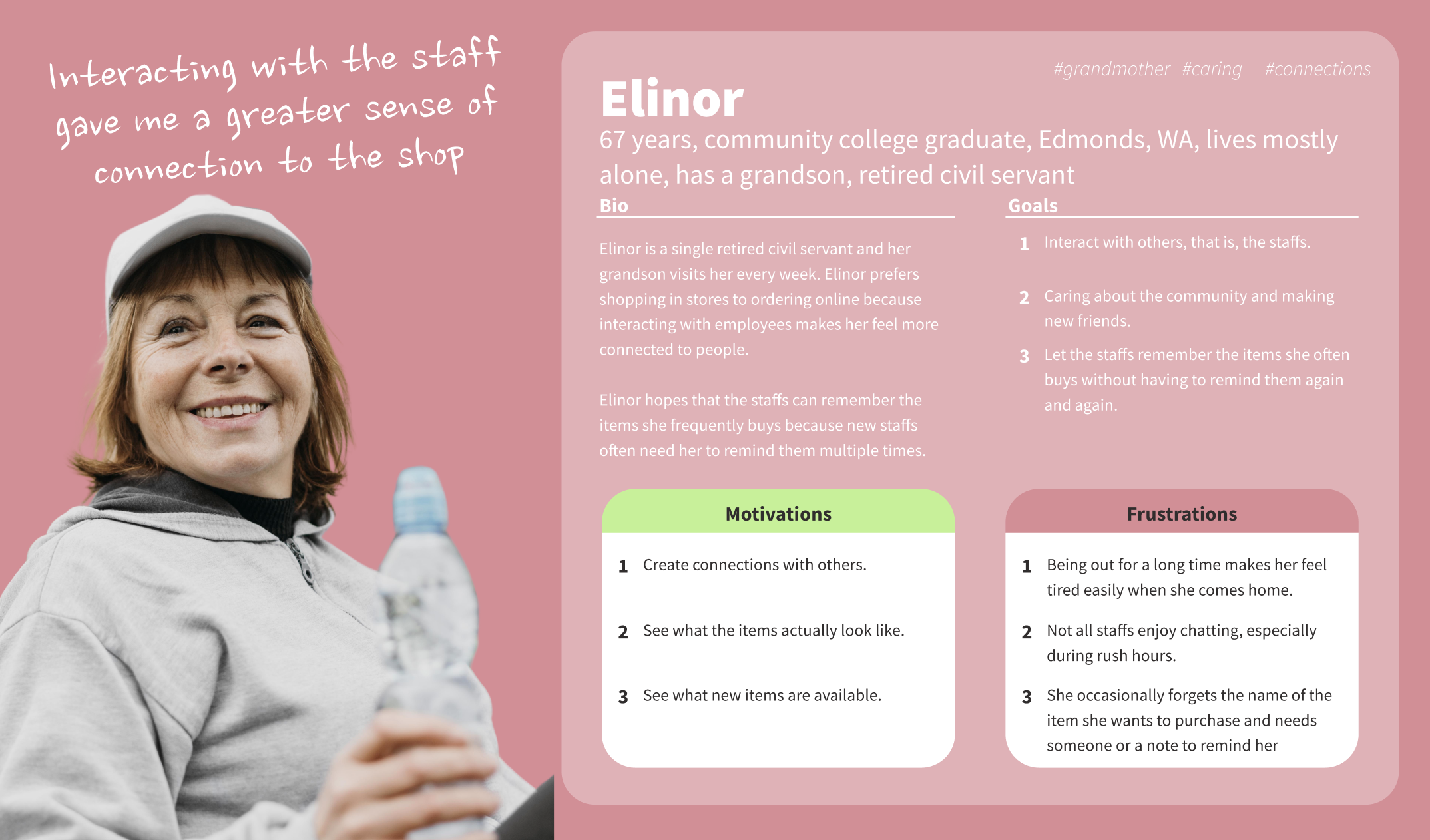
Personas
From my research, I discovered that consumers have three core needs for a successful French pastry app.
Reduce waiting time
Long queues hinder consumers from having a happy shopping experience. When consumers wait too long, they tend to give up buying pastries or go to other stores that offer similar pastries.
Ideation
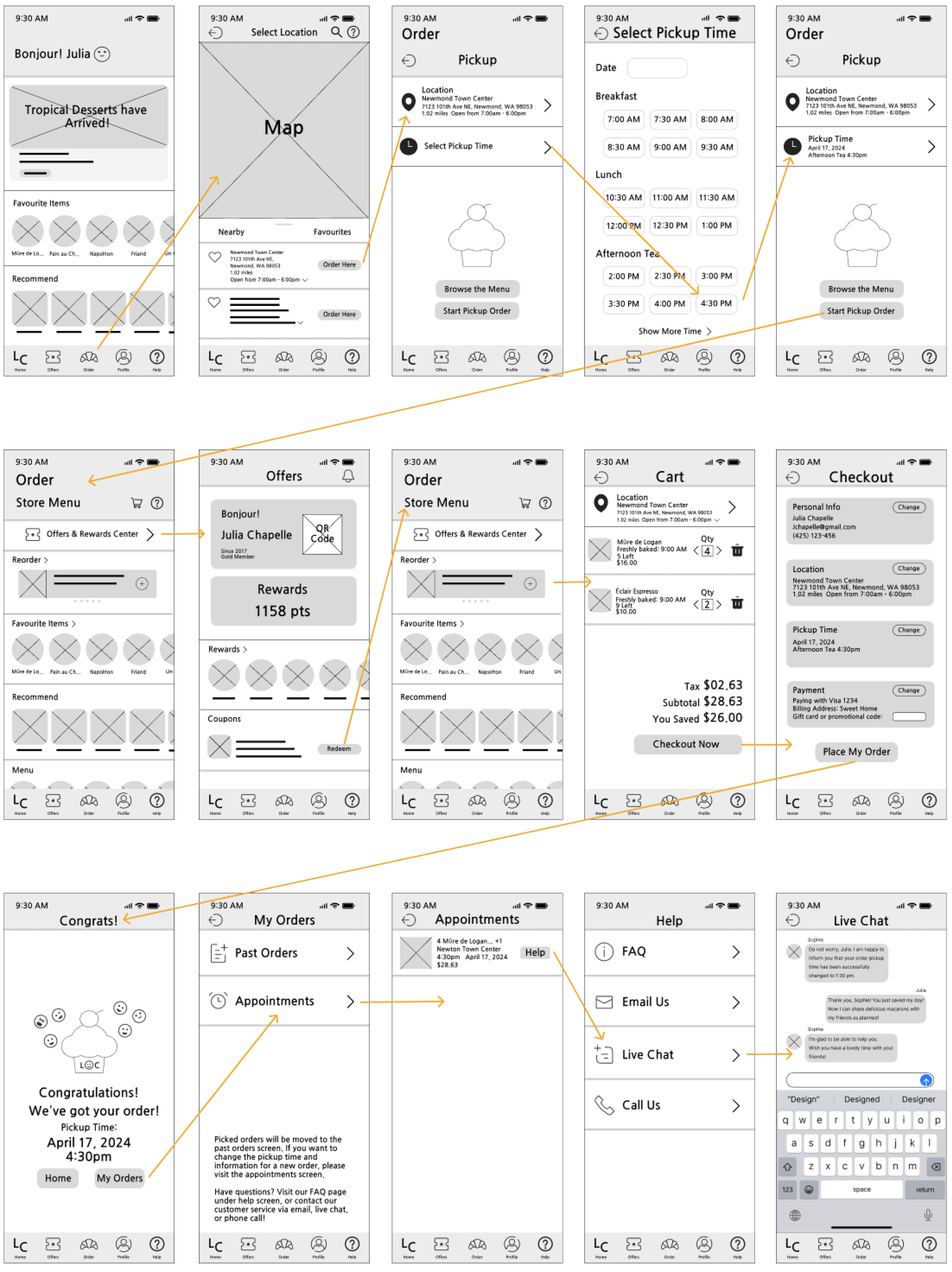
User Flow
Design
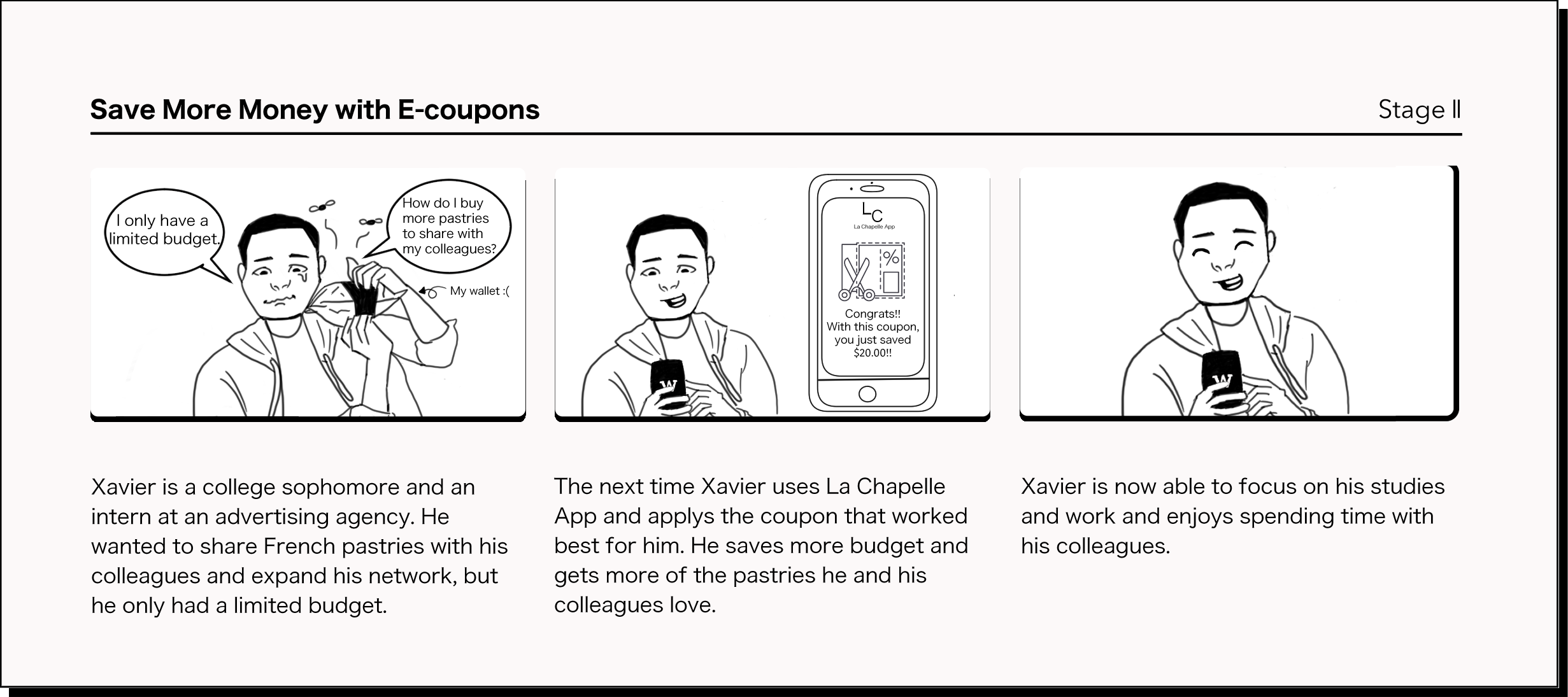
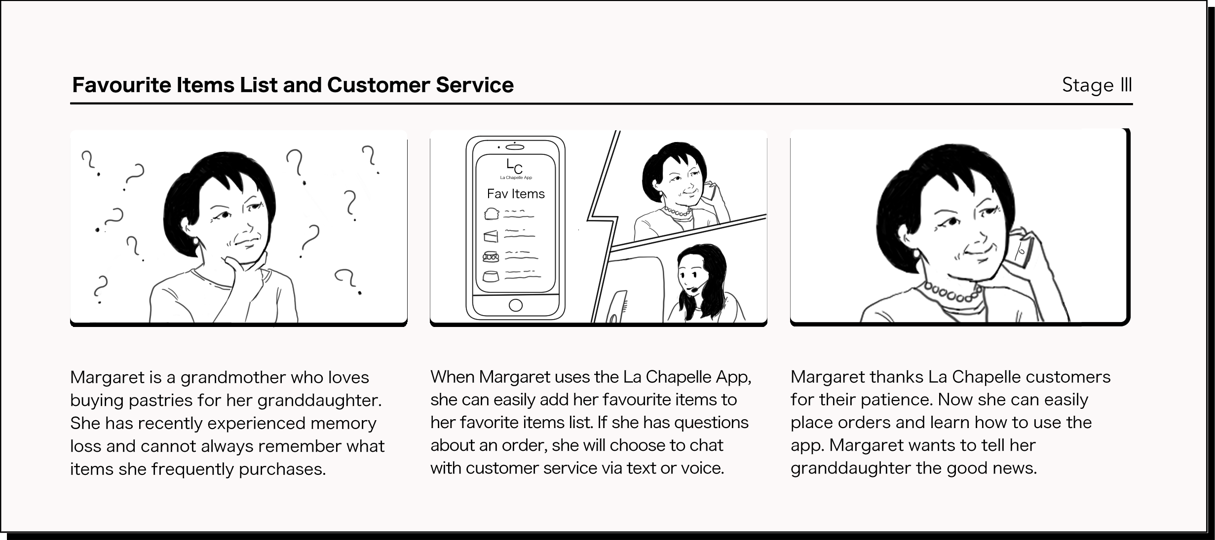
Story Boards
Flexible promotions
Consumers may not necessarily be able to participate in the store's fixed promotions according to their schedule. Consumers of different ages, jobs, and living conditions have different consumption patterns and require promotions suitable for them.
To Remember Favorite Items
Not all consumers can remember their favorite items. Memory impairment occurs among consumers of all ages and is not limited to gender, age, or ethnicity.
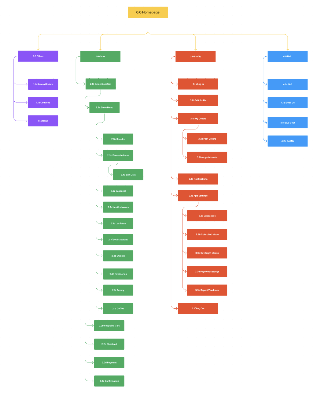
By designing the user flow for La Chapelle App, I learned that as users’ goals become more detailed, they will need to perform more actions. If the screens and functions of the application are too complex, it will reduce the user experience.
Meet Émile!
Why Chatbot for Livechat?
A chatbot is an excellent choice for answering general questions from users. Émile can give users all answers to frequently asked questions and refer users who need urgent assistance to real-person customer service for online chat.
Solution
Applying WCAG 1.4.11: Non Text Contrast
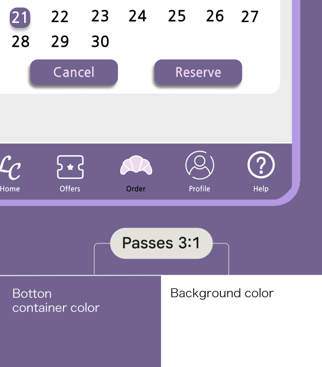
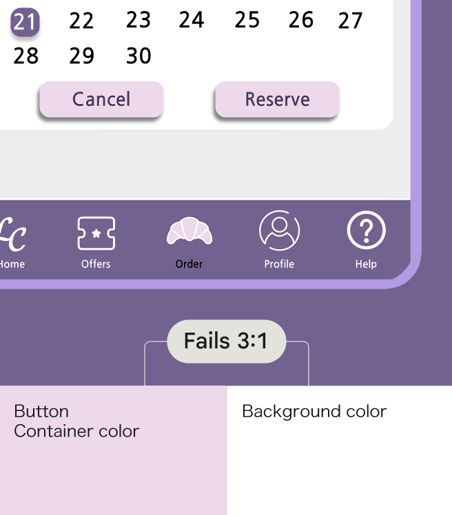
The purpose of the Web Content Accessibility Guidelines (WCAG) is to ensure that people with moderate vision impairment can distinguish between active user interface elements (i.e., controls) and meaningful graphics. Any visual information required to identify UI components and component states must meet a minimum contrast ratio of 3:1.
Clustered Components
Elements like buttons that are clustered with other elements benefit from a 3:1 contrast ratio between them and the background. They require the user to distinguish each button from the collection and UI background so that users with moderate vision impairment can distinguish the interactable elements from the background.
Home Screen
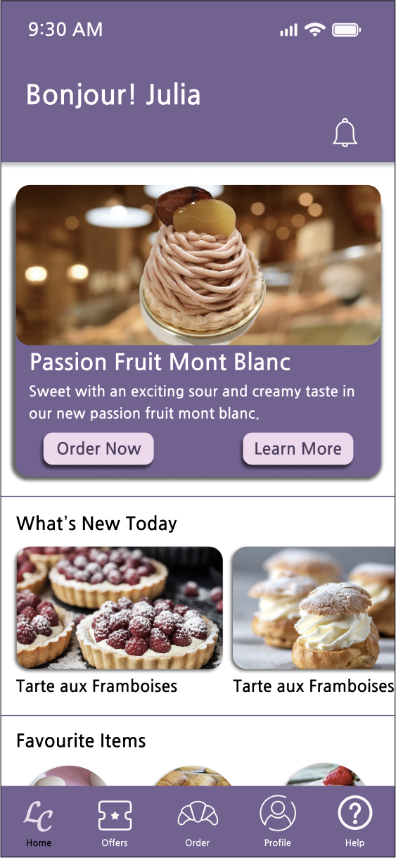
La Chapelle App's home screen displays what new French pastries are currently available, as well as what new special events and related information are currently available.
Users can choose to read more store news or add new items to the shopping cart and go directly to the pickup and ordering screens.
Sitemap
Nice to meet you!
I’m your friendly neighbor Émile!
Why native mobile app?
The native mobile application allows users to browse menus offline anytime and anywhere. When users need to order online, they can choose to connect to the Internet or Wi-Fi and complete their actions.
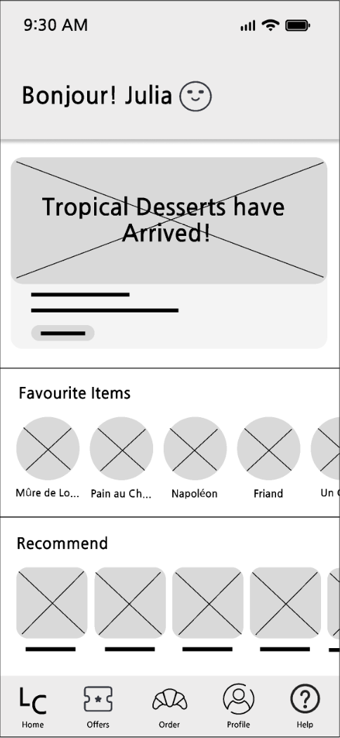
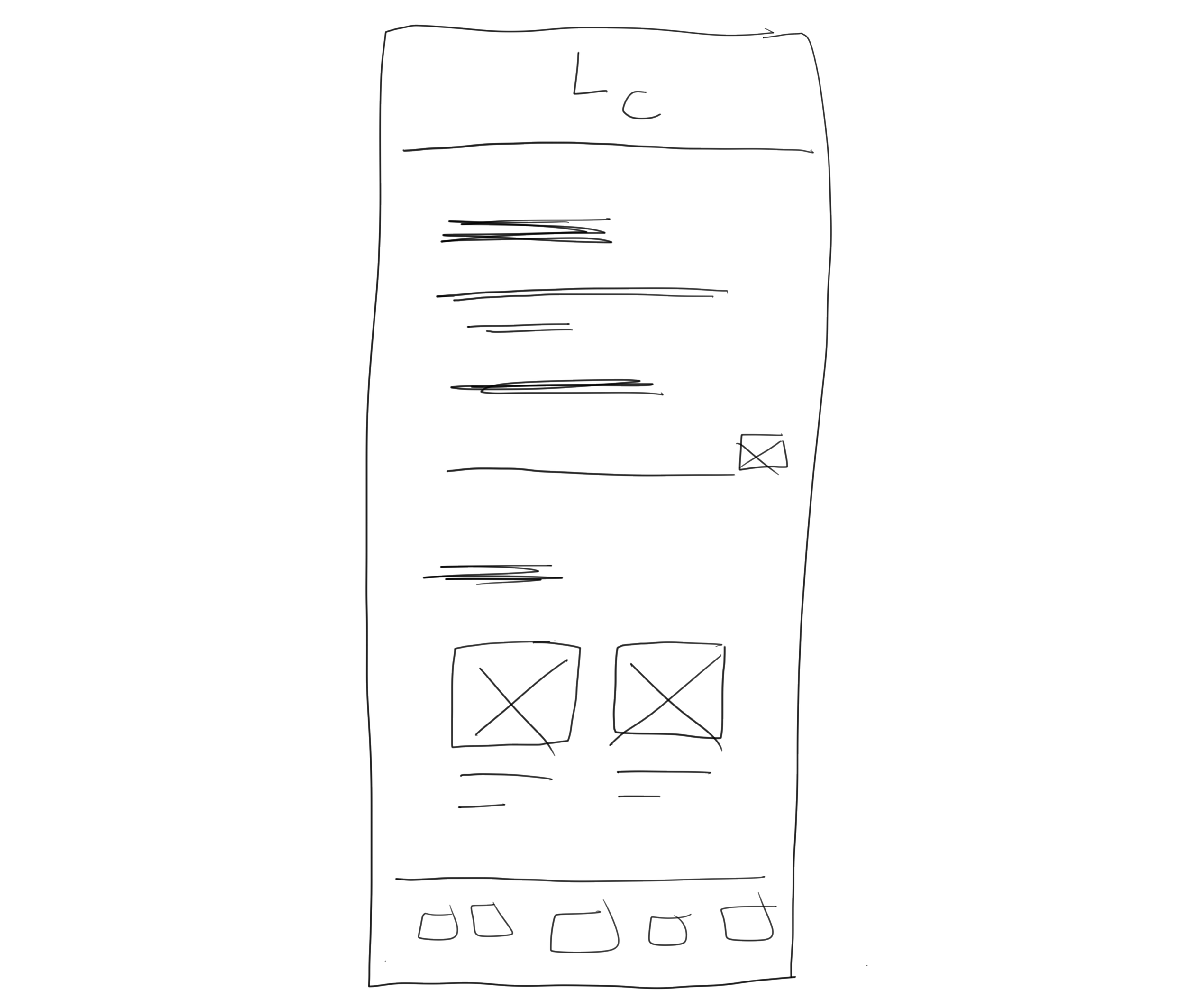
Prototype 1: Personalized Home Screen Combined with News Feed
Low-Fidelity
Onboarding Wireframe Flow
Mid-Fidelity
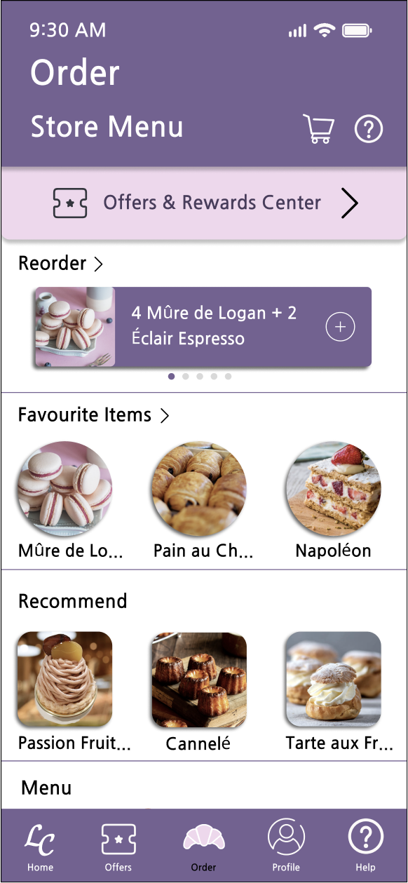
Prototype 3: Order Screen
Low-Fidelity
Mid-Fidelity
High-Fidelity
Prototype 4: Profile Screen
Low-Fidelity
Mid-Fidelity
High-Fidelity
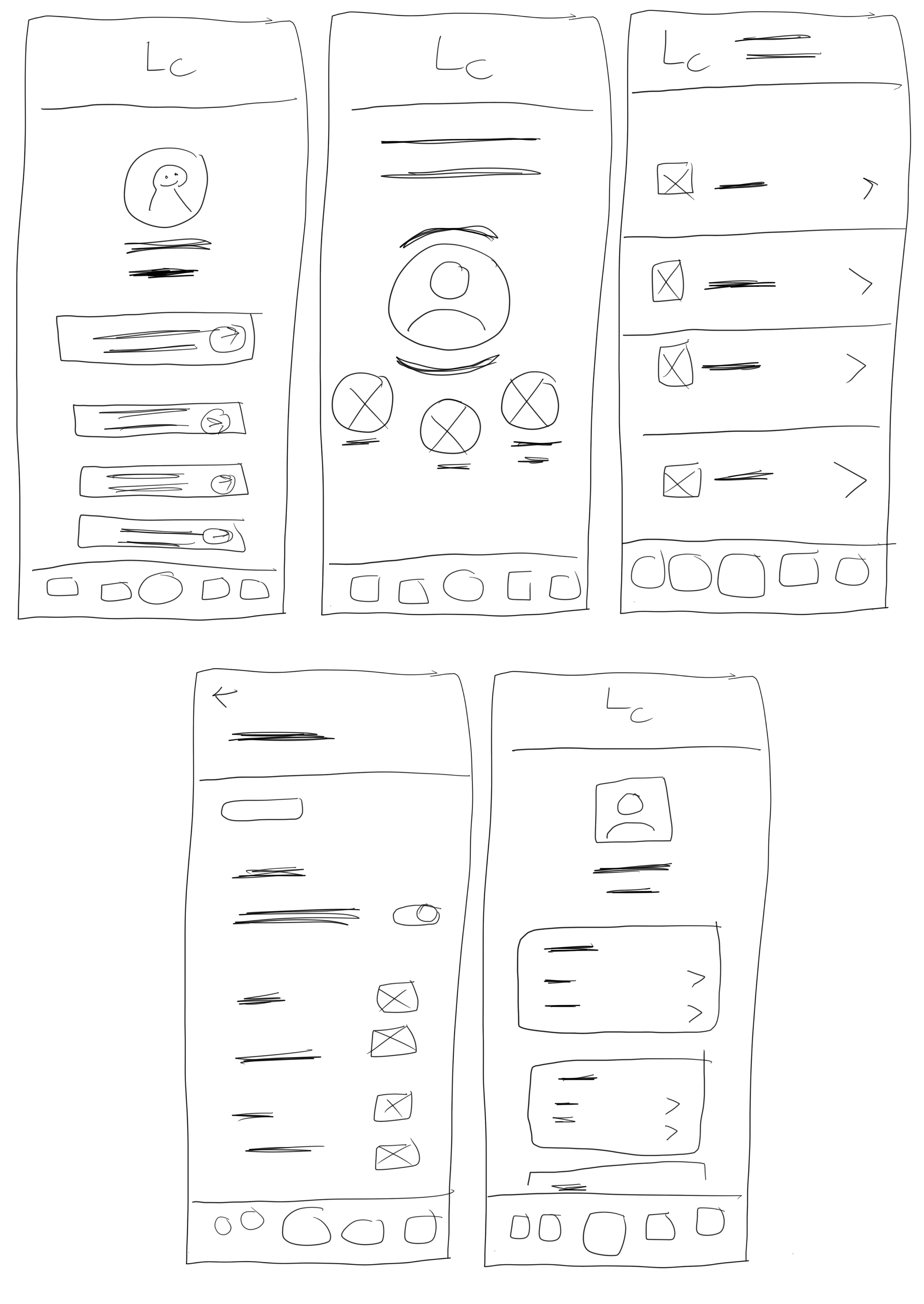
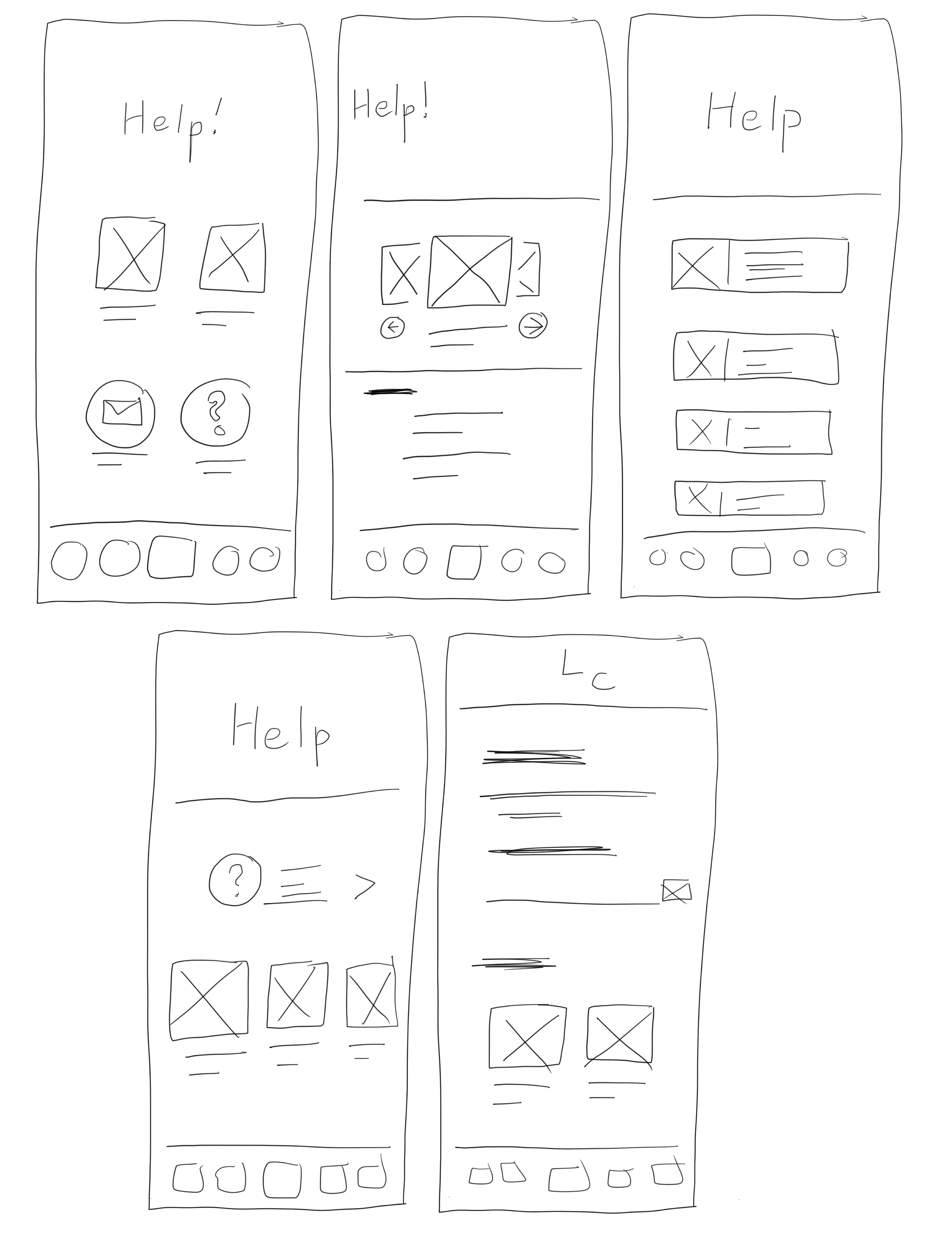
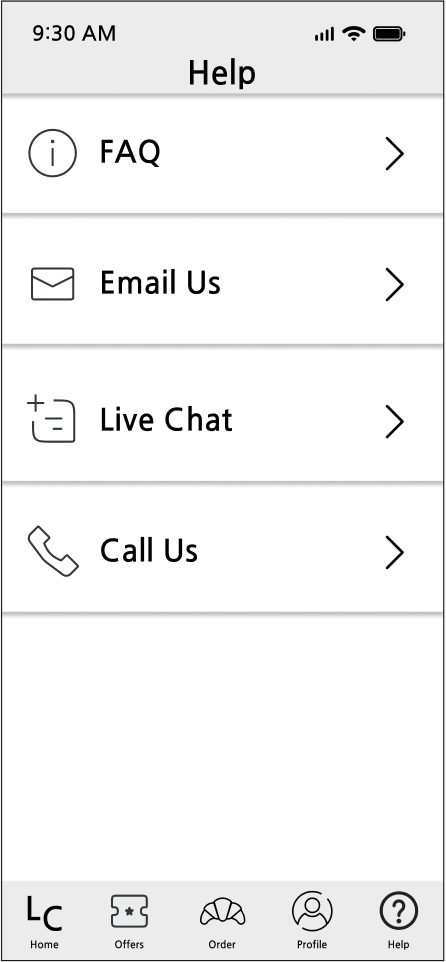
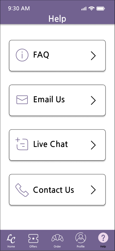
Prototype 5: Help Screen
Low-Fidelity
Mid-Fidelity
Final Iteration
When I was testing the prototypes, I found that my first prototype made the interface and functions of the main screen too similar to the menu screen, which was misleading to users. In addition, since I only considered adding as much content as possible, the fonts on the prototype interface were too small, which was inconvenient for visually impaired users. Therefore, I included the WCAG 1.4.11: Non Text Contrast specification in the redesign and ensured that the color contrast ratio between the components and the background reached 3:1.
High-Fidelity
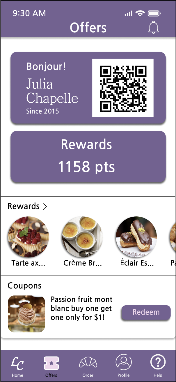
Offers and Rewards
Users can present their membership QR code in-store, view their reward points, redeem points items, and redeem e-coupons.
Based on their needs, users can add 1 to 2 e-coupons or point items to their shopping carts and continue their online shopping.
Dark Mode
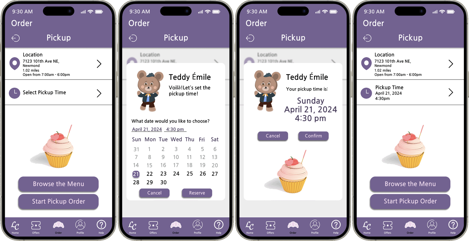
Schedule a Pickup Time
Users can select their favorite store, and the time they want to pick up their order on the pickup screen.
On the location popup window, users can not only select their favorite store, but also click on the love icon to add their favorite stores to the list. After selecting a time slot, users can choose to simply browse the menu or continue with the ordering process.
Prototype 2: Offers and rewards systems
Low-Fidelity
Mid-Fidelity
High-Fidelity
High-Fidelity
Prototype 6: Live Chat Screen
Low-Fidelity
Redesign
Mid-Fidelity
High-Fidelity
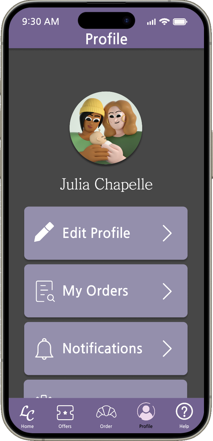
In order to consider users with visual impairments and those who cannot see a white background for a long time, dark mode allows users to use the application in a relatively low-burden state.
If users need to enable or disable this feature, they can go to the app settings screen from the profile screen and access the feature.
Live Chat Screen
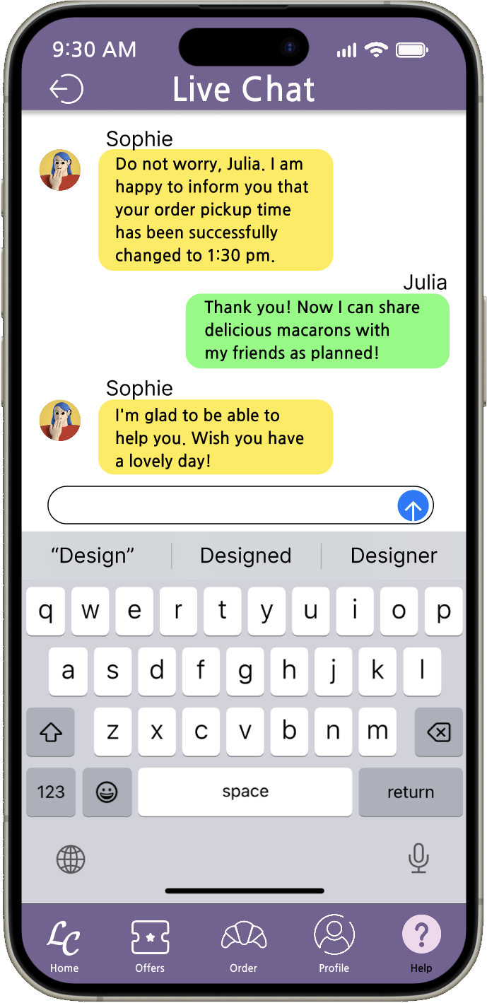
Once users encounter problems with their orders or want to change the pickup time, they can use the live chat screen to get support.
Chat bot Émile will reply to users with answers to frequently asked questions. If they need more help the system will refer them to a live customer service.
Reflection
Human-centered design thinking
While designing the design system, I learned how important it is to consider the user's feelings and their impairments in every design decision. I am able to apply my knowledge of color science and health management to the team's designs while basing design decisions on ergonomics.
Build an environment of inclusion
Conducting online polls helped me learn how to get participants to provide their most honest opinions without bias and additional concerns, as well as compile the collected data into visual charts. When I conduct peer reviews, I am able to comment on systemic or usability issues with designers’ designs in an objective and empathetic way, rather than criticizing them without supporting reasons.
Integrate skills from different fields
During this two-month period of research, design, and production, I realized that collaboration and communication are indispensable abilities in UX design. Although I am good at digital drawing and programming, working with people with diverse perspectives and design ideas allows me to identify aspects where my designs are lacking and make the application more user-friendly and user-centered.


